The other day I sat listening to Jim O’Rourke’s “Eureka” album, making sure to keep the album cover away from public view, and I asked myself, what are the albums with the most discrepancy between my appreciation of the music and the album cover? So, I compiled this list of albums which music I love with visuals I can’t stand.

Eureka – Jim O’Rourke
I find the album cover as disturbing as I find what it contains, soothing. I’m assuming this was a conscious choice by the artist, and probably reflective of a sick sense of humour. Especially if you have children you’d like to keep this cover out of view as not to risk emotionally scarring your offspring.
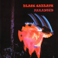
Paranoid – Black Sabbath
When it come to heavy metal, it’d be easy to do an article like this solely dedicated to the genre, but I’ve chosen Black Sabbath’s Paranoid. The album is a stone cold classic, the cover art not so much. In fact, the visuals were created with the title “War Pigs” in mind, an idea the record company nixed, leaving the cover art even more meaningless than it otherwise would’ve been.
Hard to believe, but Sabbath actually have worse covers in their portfolio, the devil fetus on “Born Again” is horrendous, but then so is the music within.
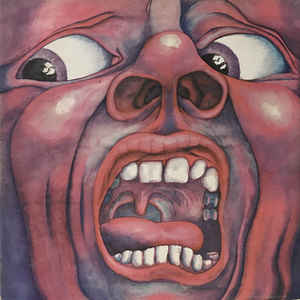
In the Court of the Crimson King – King Crimson
King Crimson’s debut rivals Hendrix and Led Zeppelin for best debut of all time. The album cover, however belongs in the other end of the spectrum of “best of” lists. Outdated, garish and unimaginative, basically all the things the music is not!
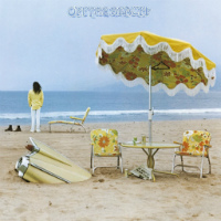
On the Beach – Neil Young
The melancholy, dreamy feel of the album is seriously undermined by the “grandma chairs and parasoll” still-life with a buried cadillac and the artist contemplating the horizon cover concept.

Satan is Real – The Louvin Brothers
Included here as the cover regularly ranks on top of “worst album covers” of all time. Why? Well, just look at the hilarious papier-maché devil in the background and the Louvins in dapper white suits happily treading “molten lava.” It is a shame, however, if the album is only remembered for this monstrosity. The brothers are gospel-country legends, and few can match their vocal harmonizing.
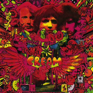
Disraeli Gears – Cream
Yea, we get it. 1967 is all about “peace and love” and mind-expanding drugs. I don’t know what drugs you need to take to appreciate this mess of a cover, and I don’t want to know! Still, one of the greatest albums in the history of rock music.

Hello Nasty – The Beastie Boys
Bad taste and humour have always played their part in the Beasties aesthetic, but that doesn’t excuse this eyesore of an album cover! Another classic in a less than stellar package.
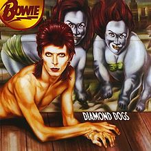
Diamond dogs – David Bowie
An underrated album, though the same can’t be said for the cover art. Bowie was sufficiently alien just being (his many) “Himself”. No need to give him a clumsily assembled man-dog body. And, those bulldog-women in the background?! The stuff of nightmares, but not in a good, cool horror flick kinda way.
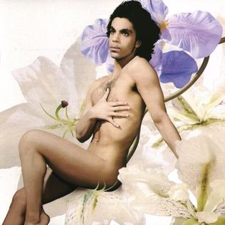
Lovesexy – Prince
Only Prince could pull-off a cover like this…, only he doesn’t. The purple one wasn’t exactly a stranger to use his sexuality to create controversy (pun intended), but here it just distracts from the funk-pop goodness that sits in the grooves.

Era Vulgaris – Queens of the Stone Age
Era Vulgaris is QUOTSA’s weakest album, but certainly deserving of a cover that doesn’t look like it was made by a toddler hallucinating on a sugar high. Not a great album, but included here due to tracks like “Sick, sick, sick” and “Make it Wit Chu”
There you have it, 10 albums I most whole-heartedly recommend listening to, just leave the album cover on the shelf!